Color As Power in Abstract Art: Creating Emotion Impact
Color As Power in Abstract Art: Creating Emotion Impact
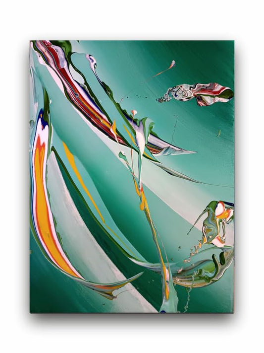
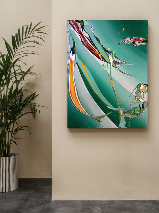
Abstract art is expression where it bypasses literal sense, hence exploring the world of emotions and ideas. The most effective devices put into expression of these feelings are the use of power of color utilized by the abstract artists. In the absence of meaningful forms, color is the only agent for emotional responses. Strategic use of colours can evoke moods, tell stories, and dig deep into some emotional reaches of the viewers. It is for this reason that understanding the psychological effect of color in abstract art is essential to any potential emotional response.
The Psychology of Color
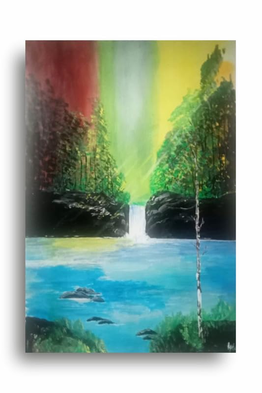
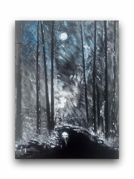
Colors evoke quite different emotional and psychological effects. Warm colors such as red, yellow, or orange create energy, passion, and warmth. Cool colors such as blue, green or purple often suggest peace, serenity, or even sadness. Abstract artists make use of this knowledge to construct particular emotional milieus.
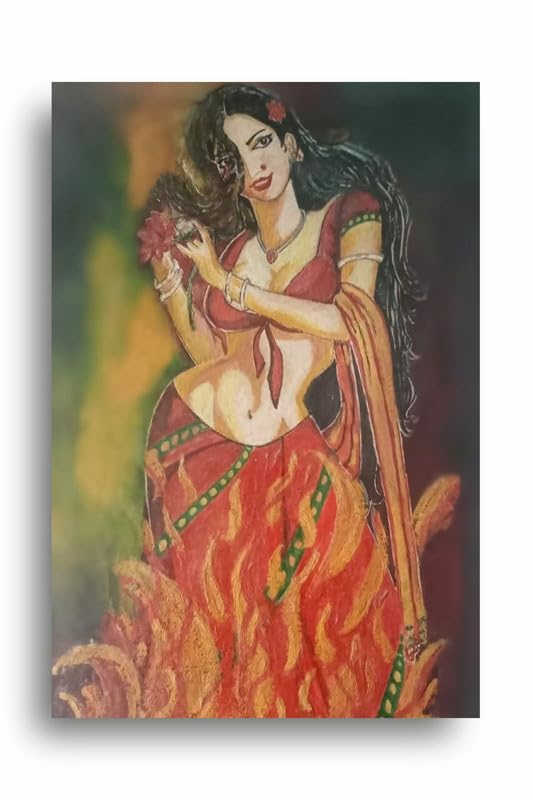
Red can often depict intensity and excitement but can also depict danger or anger; it only depends on the context used.
Blue gives a person a sense of being peaceful, but darker shades bring about sadness or even isolation.
Yellow can represent happiness as well as light. It gives one a sense of positivity and life.
In abstract art, colors are not held back by reality; therefore they can play with combinations which elicit unique feelings. For example, placing warm together with cool colors is capable of creating a dynamic tension or balance related to how the artwork seems emotionally.
The Role of Color Harmony and Contrast
The manner in which the colors play off on the canvas will significantly determine the emotional feel that the view gets. Harmony in color pleasingly arranged can bring about emotions of calmness and contentment. Contrary to this, sharp contrasts such as in the case of complementary colors can bring about emotions such as excitement or unease. Abstract artists pick color schemes to elicit a certain mood- it could be relaxation, turmoil, or even more complex.
Color and personal interpretation
One of the more interesting things about color in abstract art is the fact that it has variability to its interpretation across different persons and experiences. What one person might view with great joy in seeing bright, vibrant colors on a canvas might stir anxiety in someone else. This ambiguity drives the power behind abstract art-its ability to be interpreted so variably across people because of color.
Conclusion
The power of color in abstract art is the creation of profound emotional experiences through nonrecognizable imagery. A great deal of research can be done to understand how colors drive various emotions and how colors interact with each other, making abstract artists craft pieces that are immense emblems of emotion. Whether it is a harmonious blend or a striking contrast, color is the best emotional language of abstract art.
Color As Power in Abstract Art: Creating Emotion Impact