How to Combine Abstract Art with Typography for Original Designs
How to Combine Abstract Art with Typography for Original Designs
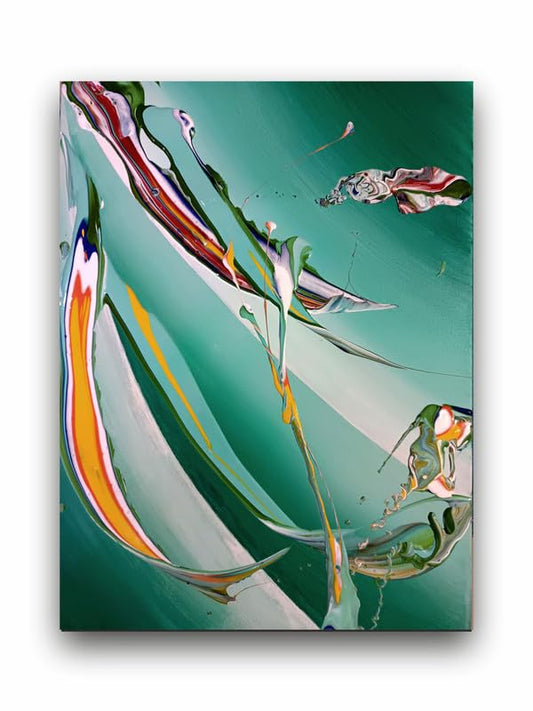
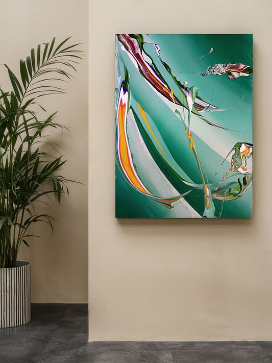
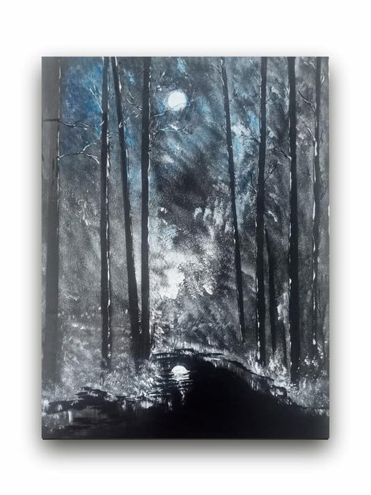
Abstract art combined with typography makes designs look incredible and conversations memorable by engaging audiences directly. It is simply an ideal solution for branding, poster creation, or enhancing a website. Here is how you can combine these elements seamlessly to give you unique and impactful designs.
1. The Balance Between Art and Typography- Understanding
A good starting point in integrating abstract art with typography is finding a balance. Abstract art usually has fluid, bold, and expressive elements. Typography is more about functional use in communicating the message with clear information that people can read. The viewer should not feel bombarded since the typography should not be swamped by chaotic and wild abstract expression. Select a font that gives a contrast with the abstract elements so that both contrast each other visually.
2. Choose Matching Colors Color will form part of abstract art and for that matter, fonts too. To ensure consistency, settle on a font that goes well with the theme of the abstract piece. For instance, if bold-colored colors like red or blue are used for your abstract, you could settle on a neutral font type to be in white or black so the art would pop out. Alternatively, use a type color that is similar to or reminiscent of one of the colors in the artwork for a cohesive, harmonious design.
3. Using Type as the Focus
In certain designs, the typography alone is the focus. If your abstract piece is really subtle, or uses softer colors, an even bolder type of font in the center or towards a specific part of the design makes the message the hero of the graphic. Experiment with various sizes, weights, and orientations to give the text a "pop". Play with alignment: centered can work great for really traditional compositions but off-center or dynamic alignments get far more exciting.
4. Layering and Transparency
Abstract art is often layered and textured. Typography with transparent or semi-transparent effects will take this even further: using them that way will make the art itself shine through, but will still allow readers of the text. This is a great method to apply designs in which one has multi-layered artwork or the depth of texture. It results in a visually dynamic piece where the text feels merged into the art itself, instead of layered on top of it.
5. Experiment with Abstract Typography
Typography can also be abstracted. Play with letter forms, distortion, or overlaid text to give the typography that magical or artistic quality. That's okay because abstract art can be put together with pure text in fluid, integral designs. Distortion or stretching of the letters, addition of shadows or textures, and assimilation of a couple of parts of the artwork into the typography can all create a fantastic effect.
6. Think About the Message
Abstract art can be emotive, while type speaks. The two, therefore ought to give the tone or mood of what you want to express. For example, a strong and vibrant abstract piece will require a bold, geometric type, while a more tranquil artwork calls for elegant, thin typography to preserve the feel of serenity. The linkage of the emotion behind the art to clarity of typography makes the design.
Conclusion
Abstract art and typography together hold boundless opportunities for the development of unique, visually striking designs. All that remains is to follow the color balance and appropriate font choices and be keen on the correlation between the artwork and the text. Explore layering, transparency, and abstracted typography to find the perfect balance between being creative and remaining readable. This type of approach will bring your work to another level while effectively communicating your message better.
How to Combine Abstract Art with Typography for Original Designs