How to Mix Bold and Neutral Canvas Art Prints for a Cohesive Look
How to Mix Bold and Neutral Canvas Art Prints for a Cohesive Look
Mixing bold and neutral art prints on canvas is an excellent opportunity to impress and enhance your space. Mixing these will create a very striking yet harmonious atmosphere. Here is how you can mix and match bold and neutral canvas art prints so that the coherent beauty is brought out.
Understanding the Color Wheel
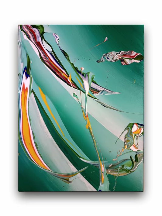
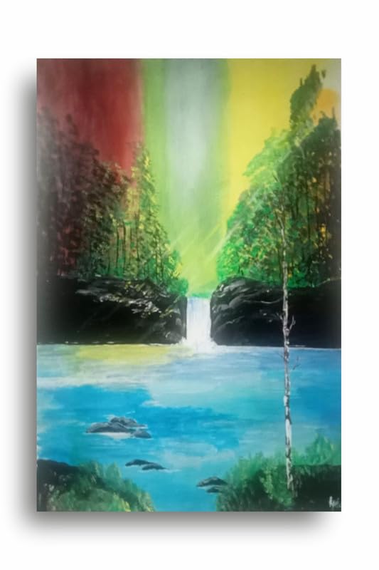
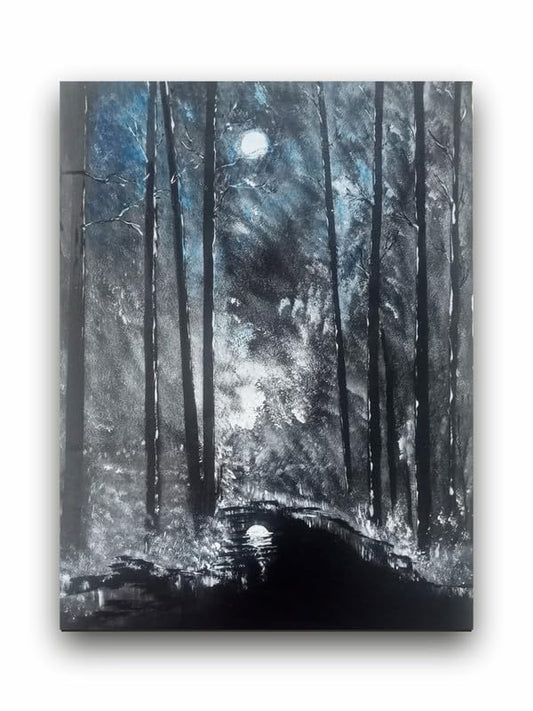
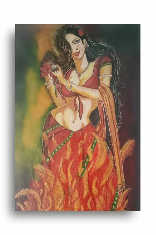
Start with a color wheel primer. Jarring prints often have strong colors. Without imagination, this creates a "clashing" mess. Neutral prints, that is, those being shades of white, gray, beige, or muted tones, play the role of "backdrop", and bold colors needn't dominate every nook and cranny. Use complementary colors or analogous schemes for achieving balance; that is a bold piece will accentuate subtleties in neutrals.
Make a Focus
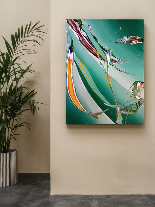
Create a focal point for your room. Consider two or three strong, bold canvas prints. Put them in a room at eye level over a sofa, near an entryway, or on an overt wall. Hang the others around the bold pieces to give it a gallery-style look. This format makes the bold prints the defining features of a room without making it seem entirely crazy visually.
Mix Variations in Sizes and Shapes
Canvas printings provide dimension and interest to your display with variation in both sizes and shapes. Large, bold prints can be used for visual hierarchy, and smaller, neutral-toned ones along the sides can serve as accents. The bright-colored abstract painting would be a nice pairing with the small, muted-toned landscapes that follow it. These will keep the eye scanning around the room without creating a disjointed look so one keeps moving around the space without losing concentration.
Utilize Matting and Framing Effectively
Framing is part of how much art is observed. For dramatic pieces, the frames must be very clean and modern to draw attention without overpowering the art. For neutral prints, ornate or contrasting gives elegance. Another aspect of getting similar styles of frames for both dramatic and neutral works means that you get a unifying effect between pieces, giving your collection a cohesive feel.
Embed Textures
Texture: It would give you another degree of interest on your wall show. Mix different materials of canvases—linen, cotton, even textured prints—to add more texture to your surfaces. For instance, mixing a vibrant textured print with a smooth neutral-coloured piece would add depth without unbalancing the look.
Pay Attention to Surrounding Decor
Lastly, consider your decor as it stands within your printed artwork. Use repeated colors with cushions, rugs, or even furniture if, for example in your bold and neutral prints, those colors apply. And this will be continuity throughout the room and your artwork will appear to simply be a part of the design. For example, should bright yellows be featured on your bold canvas, you would take a unifying approach by reinforcing them with yellow decor.
These bold and neutral-colored canvas prints were such a great combination because they were leveled-up home decor all at once with a cohesive appearance that will be a representation of your own personality. You can understand the color theory, establish a focal point or two, vary sizes and shapes, pay attention to framing and surrounding decor, and still come up with an enthralling balance that tells a story with your piece of canvas art.
How to Mix Bold and Neutral Canvas Art Prints for a Cohesive Look