How to Style Canvas Art Prints with Bold Wall Colors
How to Style Canvas Art Prints with Bold Wall Colors
Bold colors on the wall can really make a statement in any room, adding so much energy and character and personality to your space. At times, it gets incredibly hard to choose the right piece of art to pair with such bold colors. A great solution would be presented by your versatile canvas art prints. They can effortlessly work together with bold walls in relation to contrast or coordination of both. Here are some styles on how you can make canvas art prints with bold wall colors for a balanced and striking space.
1. Create Contrast with Neutral Prints
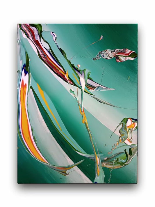
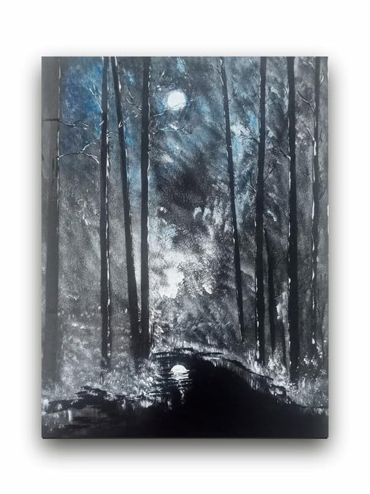
The most accessible way for the style of canvas art prints to boldly colored walls is with contrast. Choose prints with neutral tones: black, white, beige, or gray, for example, breaking up the intensity of the wall color. For instance, a bright teal or deep maroon wall can be toned down by printing monochrome abstract prints or minimalist black-and-white photography. Contrasted, this not only highlights the art itself but also leaves room for the dramatic wall color to stay the focus of the room.
2. Coordinate with Complementary Hues
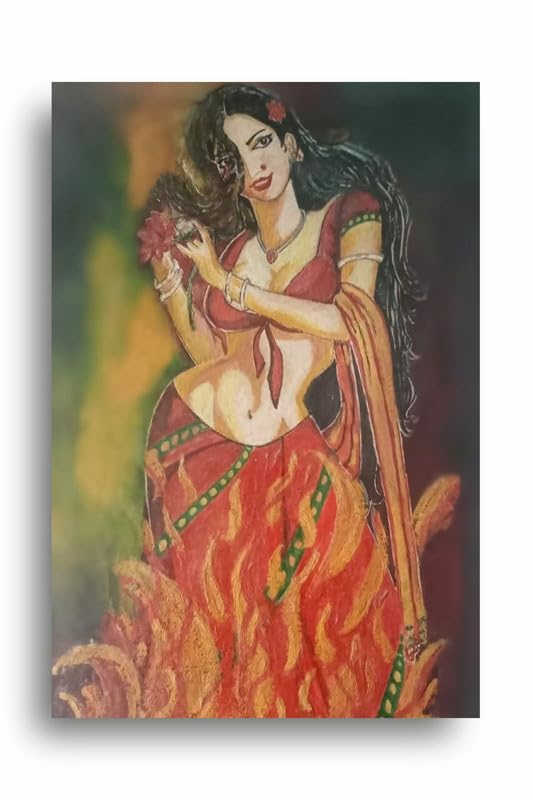
One can get canvas prints that bring in complementary colors to the shade of the wall for a much more harmonious look. For instance, if you have a deep-coloured, navy-blue wall, consider using prints that have either gold or mustard tones on the other end of the color wheel. This coordination increases the visual appeal of the room and creates a balanced and harmonized design. By finding the color in the art which correlates back into the wall, whether a small accent or even a dominant color in the piece, the trick will be in the key.
3. Balance Boldness with Similar Tones
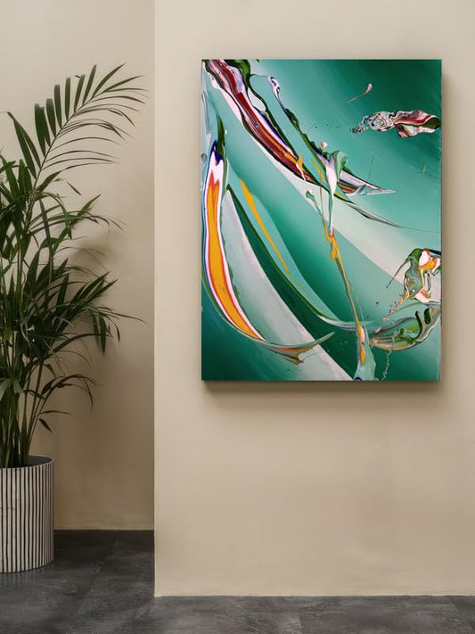
Another way of acceptance would be to pick bold canvas art prints that have a similar color palette with the wall. For instance, when the walls are emerald green and you would like to create a sophisticated, layered look with a botanical print, include lush greens and subtle nods to coral or gold because these contrasting colors will ground the bold wall color. This trick works great when you have an entire room to make feel immersive-by walls and art practically like one cohesive story.
4. Use White Space for Breathing Room
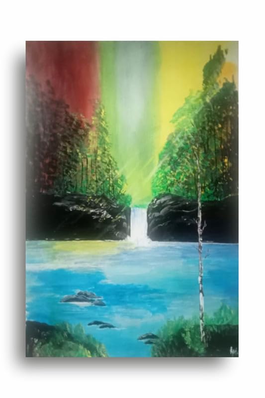
Use a very dark or bright wall color. Lighten the visual weight of your space with canvas prints of pretty imagery, which will incorporate much white space. If that boldly-colored wall is too much around it, too much can feel overwhelming, so using prints with plenty of white space lets the space in the room breathe more easily. Look for minimalist designs, line art, or abstract pieces with big areas of white or light-colored backgrounds to give some reprieve to the eyes.
5. Go Big for Maximum Impact
The bold wall colors are more effective if large canvas art prints are used in the room. One oversized print or a group of large canvas pieces can anchor the room and hold its own against a bright backdrop. Be it abstract painting, striking photography, or modern graphic prints, going big will let your art harmonize with the wall color and avoid getting lost in the strength of that hue.
Conclusion
Bold wall color for your canvas art prints is all about finding that magic balance between harmony and contrast. Whether neutral contrasts, complementary hues, or similar tones, the canvas art prints can give your bold walls a more dynamic boost while you design your space. Don't be afraid to try out different styles and sizes before you find the ideal combination that fits your personality and taste. The right combination will make your room feel dynamic as well as artfully styled.
How to Style Canvas Art Prints with Bold Wall Colors