How to Use Contrast to Make Your Drawings Pop
How to Use Contrast to Make Your Drawings Pop
While creating an excellent drawing can be said to be dependent upon the technical skills involved, at times it becomes a matter of mastering contrast. Contrast is simply the difference between light and dark, and this provides visual interest for any drawing, no matter how little or much technique is applied, be it pencil, charcoal, or any electronic media. Here's how to do it better:
1. Value Contrast Mastery
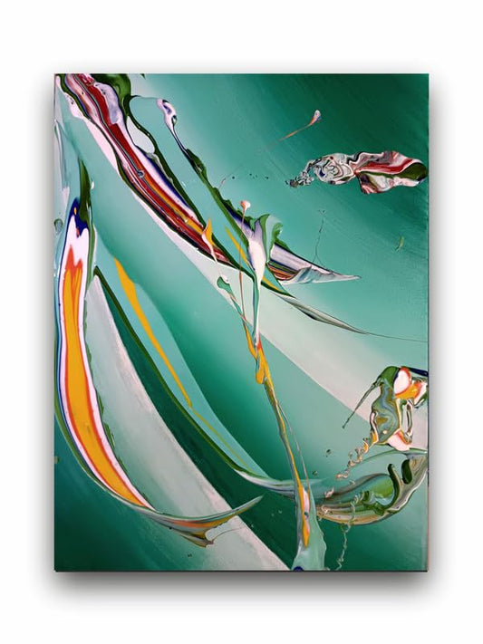
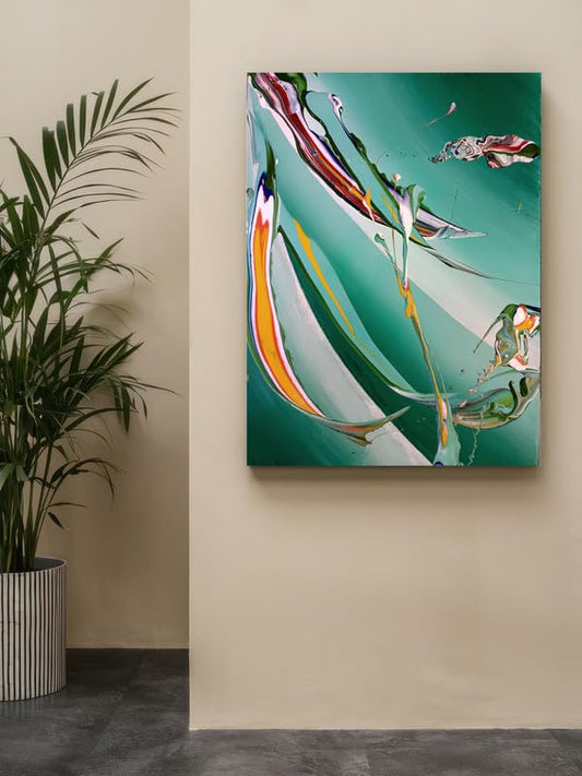
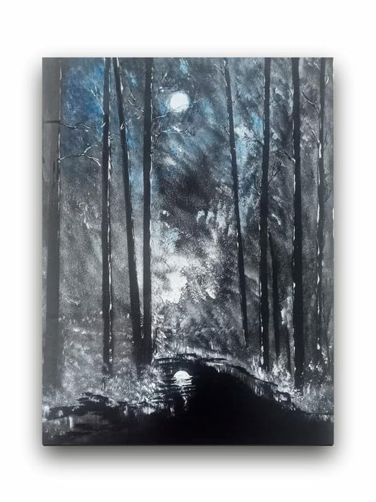
Value refers to the range of light and dark tones in a drawing. A full range of values—from the lightest highlights to the darkest shadows—results in strong contrast, which immediately draws the viewer's eye. For example, placing dark shadows next to bright highlights will tend to make your subject appear three-dimensional and realistic. Always push your values; don't be afraid to add deep blacks and bright whites.
For example, if you are painting a portrait, then creating shadows around the eyes or under the chin will deepen the face. Conversely, areas of light are put forth to draw attention to traits such as cheekbones or hair, making them highlight against darker backgrounds.
2. Textural Contrast
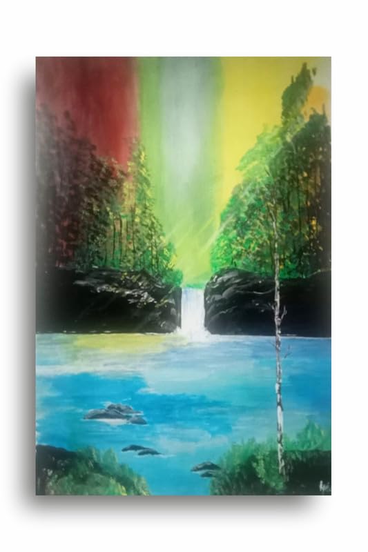
Another characteristic through which you can also make your drawings interesting is using textural contrast. This is one way of juxtaposing different textures so as to create interesting visual effects. For instance, you may contrast the smooth skin on your person with the harsh, textured hair or perhaps the fabric in a portrait. In landscape drawings, you may put soft and smooth flowing clouds side by side with rugged mountains or trees. This will give your viewer a tactile experience.
The textural contrast helps to break the monotony and draw attention to key areas of your drawing. This can be achieved through variation in pencil strokes or techniques of shading, for example cross hatching versus smooth blending.
3. Edge Contrast
Contrast is not just about light and dark it's about the sharpness of your lines. Softer blurred edges can create depth, whereas hard, sharp lines are saved for focusing elements. Use hard edges on key emphasis for points of focus, softer edges for areas that are meant to recede into space. This is going to give your drawing a layered look and will add to the sense of space.
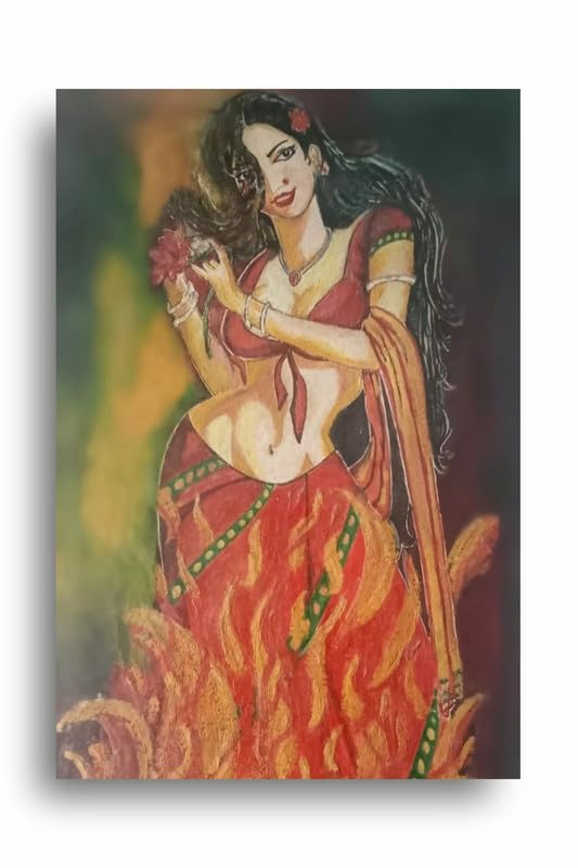
4. Playing with Color Contrast
If you're working in color, you can incorporate contrast in your choice of colors. Colors placed side by side can give some real pop if you use contrasting colors, such as blue and orange or red and green. Contrast warm and cool tones as well to make those areas of your drawing pop.
Using complementary color pairs in colored pencil or digital artwork enhances your composition and can create dramatic contrast when a subject is a warm orange set against a cool blue background.
5. Negative Space and Contrast
And lastly, don't take lightly the impact of the negative space. Leaving areas of it blank creates incredibly stark contrasts that will make those parts of your drawing really stand out. By giving your view some breathing room in how you draw, your eye gets naturally drawn to the focal point, thereby making the entire appealing impact with a drawing.
Conclusion
For instance, proper use of contrast will make sure that you create good art. Value contrast, texture, edge definition, color contrast, and negative space become the essentials that will grab the eye of your audience. Contrast is also a guide tool that will focus the attention of the viewers on the major parts of the drawing, thus turning a basic sketch into a striking piece of art.
How to Use Contrast to Make Your Drawings Pop