Role of Contrast in Abstract Art
Abstract art will always be able to elicit emotions and stimulate thoughts without using obvious, representational imagery. Contrast is probably one of the most powerful tools an abstract artist uses-it's one that makes use of contrasting elements of color, form, texture, or scale for effective pieces that are not only visually strong but very engaging too. In a nutshell, contrast provides tension, balance, and focus to abstract compositions and is therefore the thing that makes them more dynamic and impactful.
Contrast in Color
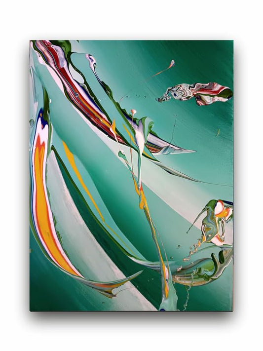
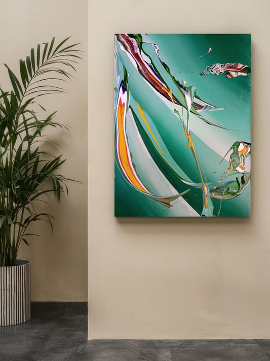
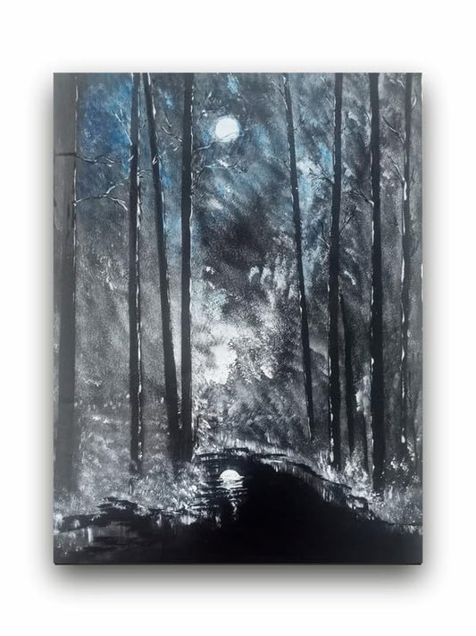
The most apparent and noticeable form of contrast in abstract art is color contrast. Imagine placing two contrasting colors side by side, blue and orange or red with green. Suddenly, the effect given out can be jarring and almost vibrational, drawing the eye. Bold clashes of light and dark, warm and cool tones stir up sentiments galore. For example, there is a lot of contrast in a bright, richly colored image, where the strong colors are in contrast with the more muted tones creating energy or excitement, whereas a low contrast may induce a feeling of calm or mystery.
With abstract art, contrast can allow colors to lead the viewer's eyes around the composition, creating areas of interest and rhythm in the artwork. The use of color when contrast defines tone and mood for the artwork, allows the artist to communicate ideas and emotions on a purely visual level.
Contrasting Texture and Form
Abstract artists also use contrasting textures and forms to enrich the work. One smooth, flowing brushstroke against a rough, jagged texture creates movement; one geometric shape combined with an organic, freeform pattern challenges the eye in searching for relationships among its elements.
The tension arising from these contrasts demands that viewers look at the art on a level beyond mere observation since they are forced to interpret the meaning behind the various textures and forms. The union of opposing elements tends to prevent the artwork from stagnating and instead gives it the dynamics of change.
Contrast in Scale and Space
Notice that there also is contrast in the world of abstract art, in colour, texture, scale, and spatial relationship. A large dominant shape against smaller intricacies of details creates a sensation of hierarchy guiding eyes to focus on some details on the canvas. Negative space-the areas that are void or blank-is also applied to emphasize the elements there in, thus an equally balanced yet bold composition.
Abstract artists use size and placement of objects to establish real depth and perspective, even though it might not offer realistic representation. This contrast in scale adds much to the overall composition giving an impression of movement, balance, and complexity to the artwork.
Conclusion
Contrast is a critical element in abstract art. It can be achieved through color, texture, form, or scale but is always striking, as it brings immense richness and depth to a composition. And contrast engages the eye of the viewer; it stimulates curiosity and emotion. With mastery over contrast, an abstract artist can create pieces that not only catch your eye but also invite reflection and interpretation, making for a truly impactful work of art.
Role of Contrast in Abstract Art